
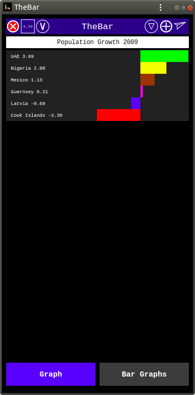
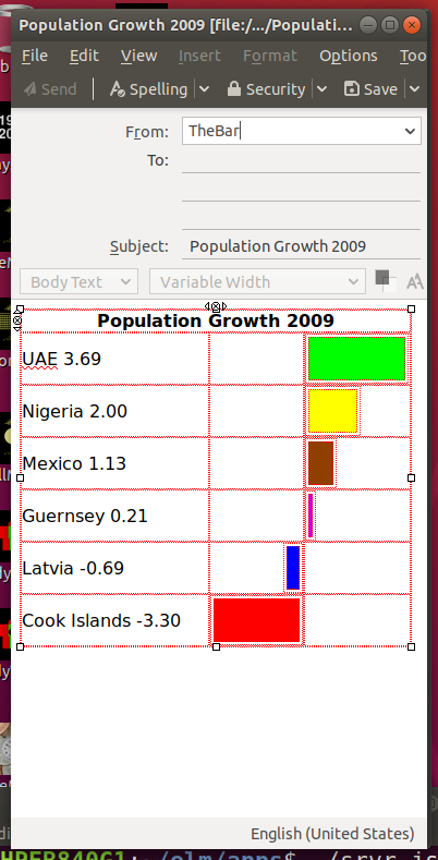
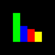
Below is a bar chart of the 2009 population growth. This tutorial will show how to generate such chart with TheBar.
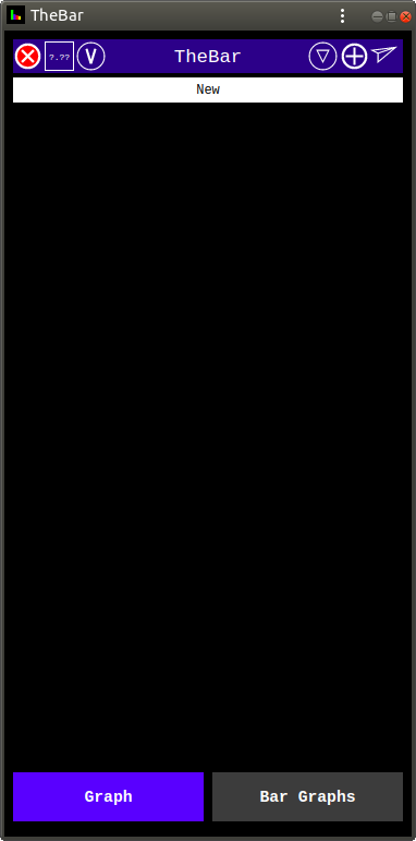
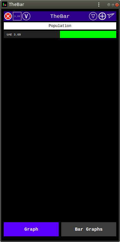
To start a new bar chart, click the Clear All red button at the top left, and you will see a blank bar chart with the name "New".
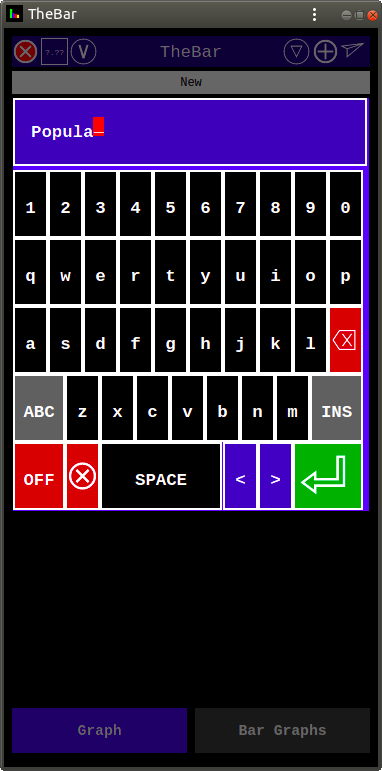
Then click on the Name Field to get the text keyboard and enter the name of the chart.
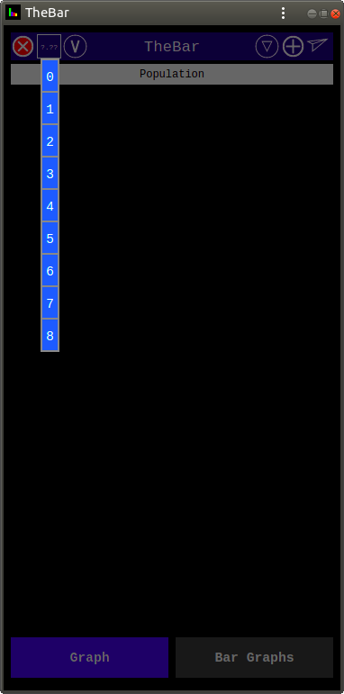
As our data uses numbers with 2 digits after the decimal point, we need to set the precision to "2". This is done by clicking the Precision Menu button (top left square button "?.??") and selecting "2" from the menu.
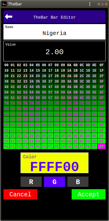
Then click the + button (top right) to add the first bar of the chart. This brings the Bar Editor.
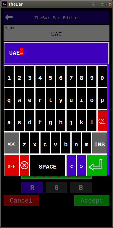
Then enter the bar name by clicking on the Bar Editor Name field and using the keyboard.
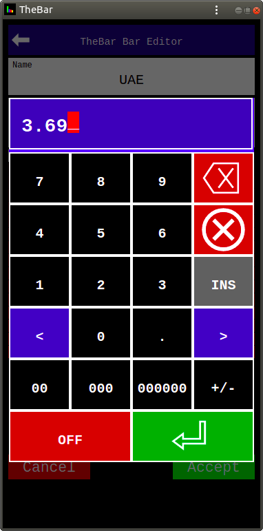
Then enter the bar value by clicking on the Value field and using the keyboard.
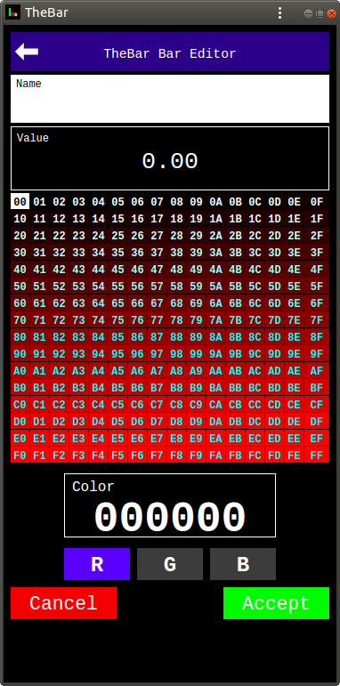
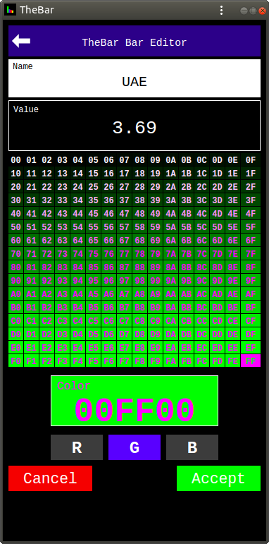
Then choose the bar color. RGB colors have 3 components "Red", "Green" and "Blue". Each component has 256 levels of brightness 0 to 255, normally given as Hexadecimals "00" to "FF".
To select a color component click the component button (R, G, or B), then select the level of brightness from the table above the Color Pane containing the Color Number. Here we select "G" to access the Green Color Component Table and "FF" to produce "Green" (00FF00).
Now "accept" the bar by clicking the Accept button to add the first bar slice to our bar.
Now add the rest of the bars data in the same way.
To get "yellow" for Nigeria, use a 2 color component combination: "Red" and "Green" to get "FFFF00" for the yellow color.
For Mexico use "8F3F00" to get "Brown", and for Guernsey use "CF00DF" to get "Magenta". For Latvia "0000FF" - "Blue", and for Cook Islands "FF0000" - "Red".
Now your chart should look as the originally supplied by us sample chart.
And you can email the chart by clicking on the Send arrow button (top right). You need to have a working and configured e-mail program on your device to be able to do it. And it can work differently with different e-mail programs.
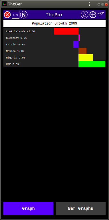
By default the bars are sorted by value, the greatest at the top. This is shown by two circular buttons at the top: "V" on the left and "Triangle" on the right.
To sort by name click on the "V" button to make it "N", and to sort smallest at the top click on the "Triangle".
When you enter an new bar graph name in the Graph View, a new bar graph is saved in the database. The saved bar graphs can be seen by clicking the Bar Graphs tab, at the bottom.
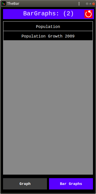
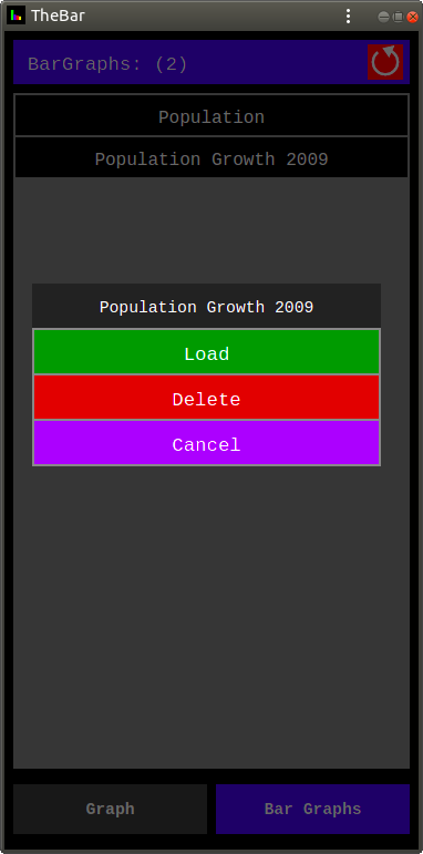
The saved bar graphs can be loaded or deleted by clicking on the bar graph name and selecting the desired option from the menu.
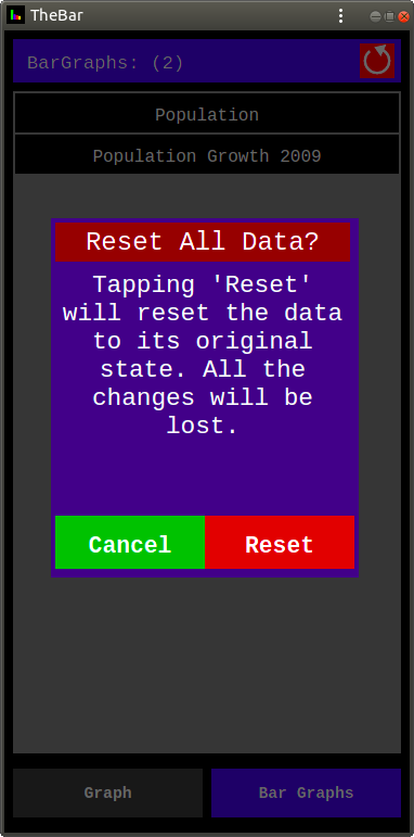
The App comes with a sample bar graph ("Population Growth 2009") pre-installed. It can be deleted. But, if you click the Reset button (red at top right) and select "Reset" from the Reset Dialog, all the bar graphs will be deleted and the one supplied with the app re-installed.
TheBar app is a universal Progressive Web Application (PWA) which works on any device (phone, tablet, desktop) on any operating system from your browser, as long as it supports modern JavaScript. And, if you install it on your device, you will be able to start it by clicking its badge on your Home Screen, like any other app on your device.
TheBar app is FREE. It has no ads and does not collect any data.
So, start making your bar graphs ...